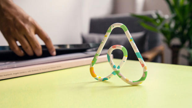
 Airbnb's new brand resembles the logos of several other companies. Looks like someone forgot to do a Google Image Search. Unveiled today in San Francisco, the new Airbnb logo--or Belo, as the home rental service is calling it--looks like a heart bent out of a paper clip. Some people like it; others think it looks like genitals (male or female, no one's really sure). The one thing everyone should be able to agree on is that it looks an awful lot like logos that are already out there. Read Full St...
Airbnb's new brand resembles the logos of several other companies. Looks like someone forgot to do a Google Image Search. Unveiled today in San Francisco, the new Airbnb logo--or Belo, as the home rental service is calling it--looks like a heart bent out of a paper clip. Some people like it; others think it looks like genitals (male or female, no one's really sure). The one thing everyone should be able to agree on is that it looks an awful lot like logos that are already out there. Read Full St...
Airbnb's new brand resembles the logos of several other companies. Looks like someone forgot to do a Google Image Search. Unveiled today in San Francisco, the new Airbnb logo--or Belo, as the home rental service is calling it--looks like a heart bent out of a paper clip. Some people like it; others think it looks like genitals (male or female, no one's really sure). The one thing everyone should be able to agree on is that it looks an awful lot like logos that are already out there. Read Full St...
Share this Article
Recommended